Foundation Portfolio
Initial Ideas
Preliminary task
student magazine front cover


Double page spread
Music Magazine Front cover


I have dceided to have the the masthead at the top of the page so our magazine can be easily recognisable when on the shelves of a shop, it would also stand out as I am going to use contrasting colours of black and white to make it stand out.
I want to position the pug around the headline or masthead as what I found when doing the similar text analysis is that when the pug is next to a big item on the cover it attracts you to the pug straight after when positioned next to it. This has inspired me to do this in my magazine so I have tried to put it near the headline and the masthead making it one of the first things that you see.
I want the main image to take up the whole page as this is one of the main items which make the magazine stand out, having a model dressed in rock clothes (leather jacket, messed up hair) which we found from our target audience would be appropriate clothing would show that my magazine is from the rock genre. From the research of my subject matter I found that most rock front covers show a chilled out rock star representing there laidback carefree attitude which they are prone to show. I would like the model to look at the audience as well to catch the potential buyers’ eye so they are drawn in to look at the magazine.
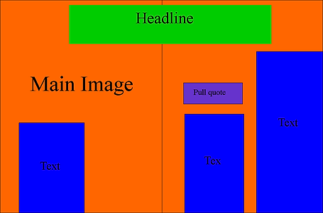
I want the headline to be in the centre of the page as this is one of the biggest things that draw the reader in, I want this to be an interesting headline, most likely controversial as this is seen usually in the rock genre.
I have added a pull quote to the front cover to pull the reader in, i am aiming to use a contreversial or an explicit quote as this would be targeted to our target audience which is young adults and rock is known to go against the rules and live life on the edge.
Contents page


On the contents page I want to keep the same house style so I will use the same colour scheme of black, white and red which I have used for my front cover. I would also like to use the same text for the headline and subtitles of which I used on the front cover, this is to try and maintain the continuity throughout the magazine. I want to have a main image in the middle of the contents page to draw the attention of the audience to the contents page, I may use the same model from my front cover to highlight the popularity of him and will influence the reader to go and look at the article he will be in. I will have 3-4 smaller images on the side of the image, this is to show the reader what else is in stored in the magazine, on the images I would put the page numbers of where you would find these articles on the images making it easy for the reader to find out where they are in the magazine. The use of the sub-headings is to show what the main things in the magazine are, I have chosen to use 3-4 to show that there are a range of different content in the magazine making it suitable for most raeders including my target audience. I have added some information under the sub-heading about the articles to give the raeder more of an insight of what's going to be on the page and having the page number next to it allows the reader to find it easily.

On my double page spread i would like to have one full page of just the main image, this is becuase when doing my simliar text analysis i saw that this was frequently used and I also thought that it attracts the reader a lot more as the image is so big it'll influence the reader to stop and have a look at it. I would like to use pull quotes around the two pages to try and intrigue the reader into reading the article, if i put them near the main image they would notice them a lot more as this would be the first thing that they would see and i want to get their attention straight away as i woudnt want them to lose their interest in the page.
for my first idea i have decided to use a structured layout because I thught that this looked most presenatble hjowever in my second design I have chosen to go with a more messy style. This is because I thought that this would suit my target audience a lot more and also the rock genre is seemed to be the hardcore genre of music so making it seem like the page is almost messed up and seem like not much time was taken doing it highlights the rock carefree attitude which it is well known for.