Foundation Portfolio
Results from questionnaire
Question 1. What colour scheme would you associate with a rock magazine?
Our results showed that 56% of our questioners chose red orange and black. When writing this question we knew black was going to be a definite answer hence why we put it in every option, this is because we thought that this colour symbolised rock the most as rock is associated with death and darkness. I think this is why most people chose this option as the red also symbolises death but adds a more creepy effect as this is the colour of blood. Thinking of our results we aren’t thinking of putting the orange in our magazine as the colour connotes more energy and warmth and this wouldn’t fit in with our genre or our target audience.
Question 2. What clothing and accessories would you typically associate with rock musicians?
In this question we found out that our target audience would like to see our musician in leather jackets and trousers. We thought that this would be the answer as this is what stereotypically rock musicians would wear, also what our target audience might wear as well so that could have influenced the results. 70% chose this whereas no one chose bright clothing, this is because this wouldn’t fit in with the genre and also this is not what our target audience would wear they wouldn’t expect the musicians too either. This makes it an easy decision of what our model would be wearing in our magazine.
Question 3. How much would you pay for a music magazine?
This question is not going to affect much on our poster just primarily on whether we should include a barcode on our magazine front cover or not. 82% said that they would pay £2-£3 for a music magazine which shows us that our audience are willing to pay for a music magazine, this shows that music might mean a lot to them if they are willing to pay this amount of money. This helps us as we now know to put a barcode on our magazine front cover.
Question 4. How many musicians would you expect to see on the front cover of a music magazine?
This was an important question to ask as we needed to know how many models we would need to get to be in our photo-shoot. However 58% chose to have just one musician on the front cover. Our task anyway is to use a medium close-up so we would have had to use just one musician but now we know that our target audience would prefer to see just one musician. I think that they chose just one musician is because it allows them to just focus on one person, and also it doesn’t make the page seem crowded.
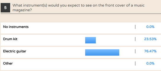
Question 5. What instruments would you like to see on the front cover of a music magazine?
This answer was vital as this gives us an indication of what the audience would like to see the musician playing, this decision would set the mood of our front cover as different instruments show different moods. i.e a drum kit would be quite hectic whereas a bass would be more chilled out and relaxed. ¾ chose for the musician to play the guitar, this is probably cause this is the most common instrument a rock musician would play , also it is seen as the coolest.


Interviews
We decided to interview two of our target audience members to gather qualitative data in order to get more detailed feedback before we start constructing our magazines, this allows us to see what they think and hopefully say what we have been thinking of doing.
The first question is to do with our preliminary task of creating a student magazine; the answers of the two interviews were very similar they both said quite bright colours as this would represent peace and to show that the school is friendly and not a threatening place to be. We would most likely use colour schemes such as greens, blues and whites as these colours connote happiness and joy which would suggest on our magazine that our school is very friendly and welcoming.
This answer was very interesting as each person opinions on a stereotypical rock musician would differ depending on what media you read and what you’re in to. The first interviewee pictured a rock musician to be very dark and to be wearing dark clothes, looking messy as she pictures the genre as a hardcore, dirty, laid back genre. Whereas in our other interview he expressed that he wanted the models to be lively and crazy, playing the guitar as he thought that this would attract him to the magazine. Using qualitative questions allows the interviewee to interpret the questions in different ways, we actually got two completely different answers; one was about their look and costumes, however the second one was more about the way the musician would portrayed himself on stage. This has allowed us to gain more information, furthermore it has helps us decide how our model/models are going to look as we agree with both answers.
This question links back to codes of conventions of a double-page spread. Both answers included a large image of the musician as they wanted them to stand out and have the main focus on him/her. One of the interviewees wanted to have pull quotes as this would catch the eye of the audience especially something controversial, this would draw the reader in to read the rest of the article. This answer helps us think about the layout of our double-page spread and has convinced us to use a pull quote as we think that this is one of the best ways to catch the reader’s eye.
This question is very useful as it gives us an understanding of what our target audience would expect to see our model/models doing on the front cover. Both interviewees wanted the musician to play guitars, this could be because a guitar is the most recognised rock instruments and also the main musician in a band usually plays the guitar. Again both interviewees would like to see our musician in their natural habitat which is on stage. The problem of which we have is that we wouldn’t be able to catch a realistic shot of the musician playing in a venue as they would not be real musicians however we could attempt to recreate this image of him/her on stage.
The last question helps us decide what colour schemes to go for in all aspects of our magazine. Both interviewees suggest black and red just like in out questionnaire, this shows that this is what colours people associate with the genre of rock which we will try and create as much as we can so using colour scheme would help us do this. White was also suggested as this is a contrasting colour to black and red we thought that we could use this for the text as it would stand out against the blacks and the reds which would attract the reader into reading our magazine.