Foundation Portfolio
Codes and Conventions
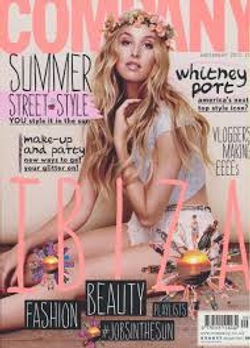
Magazine front cover
On a front page of a music magazine the masthead is one of the biggest things you can see this is to highlight the name of the magazine and make it one of the first thing the audience sees, this because it allows regular buyers to find their magazine easily and also may intrigue other buyers to purchase it. There is usually a main image, usually of a famous musician who features later in the magazine; this would want someone to buy the magazine as it could be a popular artist or the artist has been in the news that past week, the musician will be relevant to the genre of the magazine making it suitable for the target audience.
Headlines are used a lot to draw the audience in to have a look at the magazine, they tend to be bright and colourful to stand out as they are supposed to make the reader want to look into the magazine. There are often pugs on the magazine which are short words or phrases to catch the eye of the audience, these often are adverts for a freebee or a chance to win something which would intrigue the reader to search further in making them more likely to buy the magazine. There is usually a strapline under the headline, this is to give a little bit more information about the news, more likely to intrigue the potential buyer to look at this article.
On a magazine you can see a barcode this is usually at the bottom of the page, this is because it isn’t that important compared to the rest of the information. This is to show how much the magazine is, if the magazine is free it wouldn’t be featured on there. They usually add the date of the release of the magazine, this is to show the relevance of the magazine and whether that it is relevant to you. The issue number is also included to show what issue this magazine is as this would help a buyer to keep up with the new issues so they make sure they don’t miss out.
 |  |  |
|---|---|---|
 |  |  |
 |  |
Contents page
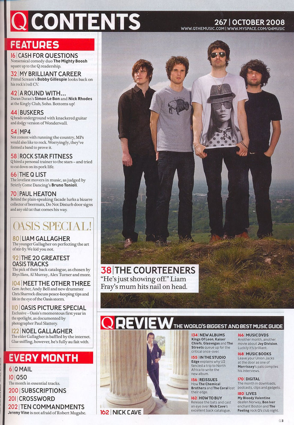
A contents page just like a front cover has different codes and conventions, these are aimed to help the reader when looking for information and guidance of where everything is in the magazine. The contents page usually contains one main image or many small images, this is to intrigue the reader into going onto these pages where these musicians are to see what the article is saying about them. The number of the page is usually on the pictures making it easy for the reader to find out where in the magazine that these musicians feature. The colour scheme is usually the same as the front cover as this keeps the consistency of the magazine making it look professional. They use sub-headings to try and draw the reader in and give little synopsis of what it is included in the article, they usually use a contrasting colour than the background to make it stand out. They usually have a heading saying ‘contents’ this would show that it is obviously a contents page, or that they would say ’what’s inside?’ to intrigue the reader to continue reading further in the magazine. They usually have a pug with information in it, this would be linked to one of the articles, again this would be a contrasting colour to make it stand out.


Double-page spread
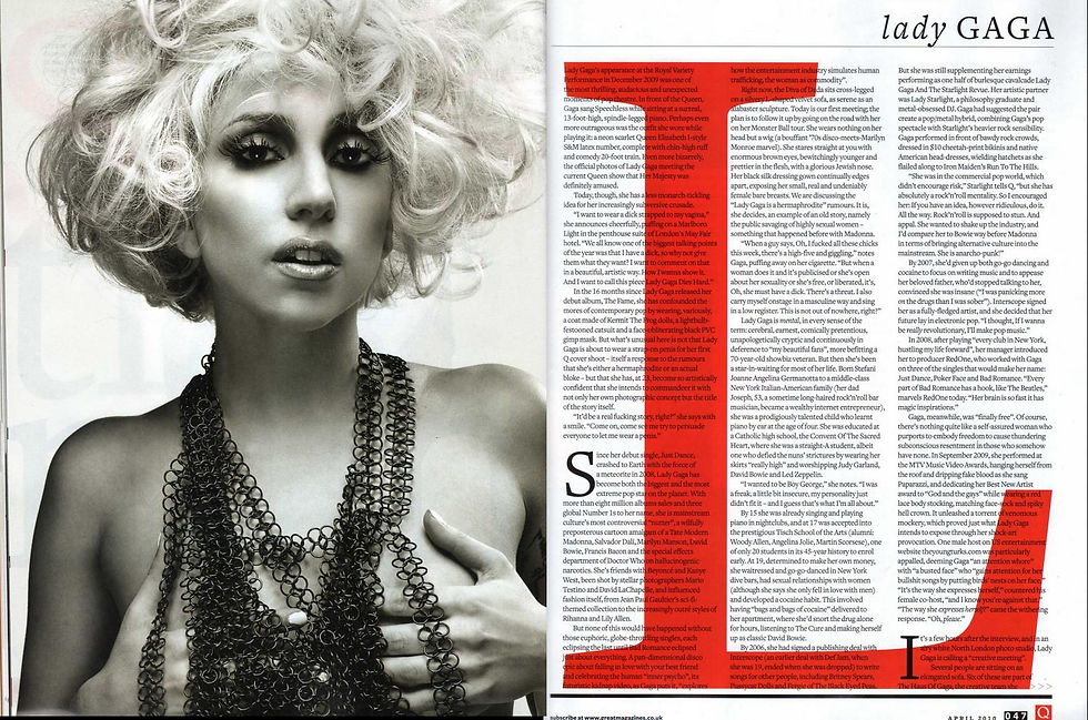
On a double page spread one of the first codes and conventions you would find is that the main image takes up nearly all of a page. This is to make it obvious to the reader who you are reading about; the image may represent what they are talking about in the article, also when flicking through the reader might catch their eye on the image making them intrigued to read it. A lot of double page spreads use pull quotes, this is to say something that would interest the reader such as a funny quote, or a controversial quote as this would make the reader want to read the whole article, also if many are used it allows the reader to catch the main points of the article if they’re in a rush. The title of the article can be a pull quote as well as this stands out and shows it’s coming from the artist’s point of view it also allows the reader to get into reading of the article straight away. The colour scheme of the double page spread is kept the same on both pages showing that they’re linked and the colours usually tend to be related to the artist, genre or to the subject which is being talked about.


Student magazine
Front Cover
The front cover of a student magazine follows the basic codes and conventions for most magazines, they usually have a main image, as this is a student magazine they would usually have a student on there doing something intellectual to show that their school is a good school, the students are normally smiling to show that it’s a good environment. Other things such as being multicultural, kids being active and doing work are common images on a front cover. The layout of the front cover is usually neat as this would represent the school in a positive manor as it would seem like they are organised and professional. The colour scheme is normally quite bright colours like green and blue as this connotes safety and friendship which is a good thing to show the reader especially as they could be a potential student. Unlike the music magazine it is not as common to have a puffs and pugs on the magazine it really depends on the age of your audience as a younger audience would have puffs and pugs as they would rather just flick through and skim read the information whereas as an older audience would more likely read most of the magazine without having to be persuaded on the front cover. They would have an issue number and a date the article was released on this lets the audience know if this relates to them or not.


Contents page


The contents page would usually have a heading either saying the school’s name, contents page or a something like ‘what’s inside?’ this makes it clear that this is a contents page. A school magazine would usually have many pictures or their content page so you can see what installed for you, also this can show which is the more formal and which the more informal as not all students would want to read the formal articles. The page numbers are normally on or next to the image allowing the reader to easily find out where the article is to go with the picture. Most schools would have their school logo on the magazine and also their logo, this would mainly be for potential students as this could show what type of school it is.
All Magazines
Front cover
These codes and conventions are seen throughout all magazines. All magazines usually have one main image which takes up nearly the whole page, this is usually a celebrity or a popular icon which is featured in the magazine, they do this as for when a potential buyer is looking at a magazine if they recognise the person there is a higher chance of them buying it. The masthead is usually one of the biggest items on the magazine front cover and normally is big and bold, this highlights to the audience that this is the magazine company so if they enjoy it they know straight away which company it is, also you can easily see on the shelves in the shop which magazine it is.
All magazines have a specific colour scheme for example ‘Q magazine’ uses red and white on all of their front covers. This creates a house style in the magazine showing continuity and professionalism in the magazine, also if the colour scheme is so thorough the colours could remind them of the magazine influencing them to pick up a copy. Headline and strap lines are usually visible on a magazine front cover as these words and short phrases are used to intrigue the reader into looking into the magazine.
There is normally a barcode at the bottom of the page (only if the magazine costs money) this is to show how much the magazine costs. The issue number and date is usually featured this is to allow the reader to see if the magazine is for them and is that it effects them.


Contents page
The aim of a contents page is to direct the reader to find the article they are interested in, all magazines do this in a similar way. A code which is usually used is having the title of ‘contents page’ or a question such as ‘what’s inside?’ at the top of the page, this shows the reader that this is obviously the contents page and having the question intrigues the reader to have a look inside the magazine.
Pictures are sometimes used to show a sneak peak of what’s in store for the reader in the magazine, the number of the pages are usually shown on or next to the image to easily show what page they’re on. There are usually sub-headings which are used to explain using a line what the articles are about, they could be shown in a different colour to the colour scheme to make it stand out. The colour scheme for a contents page is usually the same as the front cover as this is keeping to the house style. The numbers of the page of the articles are usually next to the titles of the articles which are usually shown in a list format as this is easy to read and easily understandable.
 |  |  |  |
|---|---|---|---|
 |  |
Double-page spread
The codes and conventions of a double page spread for magazines is that there is usually an image taking up one whole page, this is usually an image which is related to the article either the person on item the article is about. There are usually pull quotes used in the article or around the image to attract the reader to read the article as the quotes are used to pull the audience in. The colour scheme usually relates to the genre and subject of the article, or it is the same with the house style showing the continuity in the magazine. The title of the double page spread can be seen either page but it is usually quite big as there’s a lot more space on a double page spread than a normal singular page article.

