
Foundation Portfolio

ALL MAGAZINE
FRONT COVER
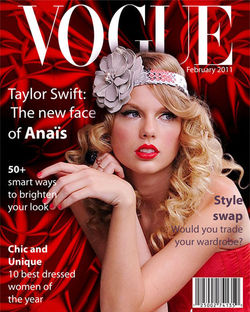
On all magazine front covers, we expect to see that it contains a main image, a masthead, a barcode with potentially a price next to it, and a date. The main image is the focal point of the whole magazine, designed to lure in the reader to make them want to purchase the magazine. Depending on the magazine the main image will always be based around the genre of which it features, being symbolic to connote different feelings, emotions, and beliefs. Furthermore, it will always target the audience that the magazine is aiming at, allowing the issue to become successful which then leads to the magazine competing with other companies to get the highest amount of sales.
All magazines will contain a masthead which is typically the boldest piece of text on the front cover. It allows the public to easily recognise the magazine company simply by looking at, conventionally, the top of the magazine. It is usually short and snappy to allow it to be memorable and attractive to all audiences (some may feel overwhelmed by a long masthead). Due to it being a part of the magazine company’s house style, it allows the audience to recognise the magazine quickly and easily, especially when particular issues look different to what is expected.
There is always a barcode located on the magazines front cover, which allows the company to detect how many sales a particular issue or issues, are making. It is helpful for the designers and creators of the magazine as if the company has fewer sales than usual; they know that the audience doesn’t like a particular aspect of the magazine. This is helpful to the company as it allows them to adjust the magazine so that it can suit their audience even further. If the magazine has a price and is not free, there will be a place on the magazine which may be located either near the barcode or in a pug where a price will be stated. If positioned in a pug, it gives the audience a sense that the magazine is offered at an amazing price considering the interviews and articles published inside. This is because it is in its own section within the magazine where the text can stand out against a plain opaque background, whereas if it was placed straight on the main image, the deal would be less effective. It gives the audience a sense of a ‘bargain’ as they are getting all the content expected to come from a much more expensive magazine, in a more affordable one.
A date will be always issued on the magazines front cover and will be typically located underneath the masthead. This is used to inform the audience to whether particular issues are relevant to them, especially if they are looking for the latest gossip within the celebrity world- they don’t want to be reading magazines published two years before this.
Magazines have a particular colour palette in which they can use on the front cover. Editors and designers typically only used around three colours to look as professional as possible whilst not being overwhelming. Colours can connote and symbolise different meanings, therefore companies are very specific and limiting with their colour choices. For example, a children’s magazine is more likely to have bold bright colours which are exciting to the eye because children can get bored easily, therefore need something intriguing and full of colour to keep them entertained.
ALL MAGAZINE CONTENTS PAGE
All content pages will include specific headlines from throughout the magazine which are likely to be the most interesting pieces of text. This allows the reader to have a brief insight into what the magazine is going to feature- artists and celebrities, the genres it focuses around etc. Next to these, there will always be page numbers which correspond to the page(s) in which the headlines have been published on. This allows the reader to easily locate articles in which they want to read in depth and those that appeal to them the most, rather than having to look through the article page by page.
The contents page will typically feature images that are relevant to the magazine or those who feature later on in the magazine also. They are used to attract the reader and make them want to continue to read the rest of the magazine. Like the front cover, a contents page also has a specific colour scheme which is typically the same as the front cover. This makes it look professional and makes the magazine look unite and emphasises the fact that they are part of the magazine.
Certain headings will have a strapline underneath to place emphasis on key events that happened on a particular page. These may be pull quotes which are designed to lure in the reader with possible controversial or funny statements made by celebrities. They may just give extra information on what a particular page or interview is about to allow the reader to have an insight of what may feature on that page. It allows the reader to pick and choose what they want to read, instead of reading each page and potentially feeling bored after reading a few pages.
ALL MAGAZINE DOUBLE PAGE SPREAD
On a double page spread, you would typically find an article or interview as well as a main image. If an interview, the editors will potentially keep the same language that the interviewee used ( E.g. Swear words) so that the audience can get a better understanding of that particular persons views and opinions. Leaving the language can also allow some audiences to relate more, especially if they use the same type of language and have similar opinions. The font size will always be relatively small so that the image is the focus of the page and sometimes there will be a drop cap to inform the reader of where the article begins. The text will be positioned in columns to give the page a professional and neat look.
The main image will always be big and cover the majority of the double page spread. Typically, the person who has had their photo taken looks directly at the reader which entices and encourages the reader to buy the magazine. There will always be a headline to lure in the reader and sometimes a pull quote is used to highlight and put emphasis on what the article is about – attracting the reader.
Likewise to the front cover and content page, the double page spread will too have a colour scheme which is typically three colours. Sometimes the colour scheme may continue throughout the magazine to give it a professional look, however sometimes editors change the colours of the text so that it suits that page and the content that is on it.
MUSIC MAGAZINE
 |  |
|---|---|
 |  |
 |  |
 |
FRONT COVER
On a music magazine, the main image will always feature an artist which has either released a new song, a new musician which has recently been signed to a company or someone who has recently been featured in the news. This automatically attracts readers as most individuals want to find out about the latest gossip within the music industry and always want to find new artists which they think they would enjoy. The artist will be typically looking directly towards the audience, luring them in and enticing them to buy the magazine.
Like any magazine, a music magazine will also have a particular colour scheme that is usually around three colours. Specifically, the colour scheme usually depends on the genre of the magazine, for example: a rock magazine will always have dark colours such as: black, navy and red. Having a colour scheme emphasises the genre of the magazine and appeals to certain audiences, especially those which love a certain genre.
A music magazine is likely to have a pug, which is designed to allow puffs and possibly pull quotes to stand out against the rest of the magazine. Puffs and pull quotes catch the audience’s attention by advertising certain areas within the magazine.
CONTENTS PAGE
A specific genre will always run through a music magazine, even on the contents page. Like all contents pages, a music magazine will have headlines which have been taken from specific pages and have numbers next to them which correspond to the page numbers where the headlines link to. Sometimes the headlines will be in a font that emphasises the genre of the magazine. For example a black, bold and grungy piece of text is more than likely to be used on a rock magazine, whereas a soft, thin, and italic font suits a classical magazine and will be used on it. Again, like all magazines the colours scheme (which is typically three colours) will also be on the contents page to add continuity.
There may be one or numerous images as the main image on a music magazine. If it is an alternative magazine, it is likely that there will be many images on the contents page as it is displaying all the genres and artists mentioned from all different backgrounds- the audience may not realise which artists are featured in the magazine as it doesn’t target a specific genre, therefore they simply turn to the contents page to find out. Specific genres, such as rock, may just simply have one main image on the contents page as it may become overwhelming to the reader with loads of images on the same page that look similar to each other. The main image of a rock magazine may be a band such as the ‘Artic Monkeys’, which further lures in and attract the audience as they’re well known around the world.


DOUBLE PAGE SPREAD
On a double page spread, there will always be columns on a music magazine to give the pages a structured and professional look. These attracts the reader as there isn’t one huge block of writing which can be seen as overwhelming, and turn those away who cannot be bothered to read tones of text.
There is typically one main image, will smaller images placed around the rest of the double page spread. The main image is usually of an artist or musician and often they stare into the eyes of the reader to attract them into wanting to read the main piece of text. If the main image is considered interesting and exciting to look at, it often means that the text will also have the same effect which again draws in the audience to read the main piece of text.
A pull quote might be used which may be: comical, controversial, interesting or factual. “My album is being release on 30th October” is an example of what I would expect to see as a pull quote on a music magazine because it is relevant to music magazines, exciting and a special moment for the artist who created the album. It intrigues the reader, especially those who love the artist as it enhances their excitement for the upcoming release.
sTUDENT MAGAZINE
FRONT COVER
A student magazine front cover will always feature a main image which has relevance to the school and possibly have a connection with one of the main articles or interviews. Typically, the person as the main image looks directly towards the audience to lure them in to make them want to buy the magazine. Usually, the model as the main image is always happy and smiling, portraying that the school is a great environment for teenagers to work in.
Sometimes student magazines are free; therefore they may not have a barcode or price printed on the front cover. Some editors may not feel the need to place these on the front cover as it may deter the audience from buying it, especially those who are originally not willing to pay for the magazine.
Like all magazines, student magazines will also have a specific colour scheme to look professional and to attract the attention of the audience. Unlike a children’s magazine, a student magazine will use colours which are considered formal and sophisticated such as: black, blue and red. Other colours which may be relevant to events occurring throughout the school, such as raising money for ‘Children in need’, a colour scheme which mainly revolves around yellow will be used to promote the charity further so that more money can be raised for the cause.
A student magazine will usually feature a pug to which is relevant to all the students at a school. Pugs pin point and highlight key information that is featured in a particular issue of a magazine. For example, there may be a pug with bold text inside indicating to the audience that there is helpful revision tips and resources on a certain page that we should all read. Without these pugs, students may be unaware that there is this type of information featured in the magazine and may disregard it as they believe that nothing featured is usually relevant to them.
contents page
A student magazine will always have a contents page with headlines that correspond with certain page numbers, making it easy for students to locate certain pieces of text without having to carefully find and retrieve information. This is good; especially for students because they tend to have a much busier lifestyle, with limited free time, therefore this ensures the quickest way possible for an individual to read certain parts of the magazine that they want to read.
Headlines will be bold, and may have a pull quote to attract the audience and to entice them to want to read specific articles. Underneath these, there may be straplines to give extra information to the reader which further encourages them to read the magazine.
There may be one main image, or numerous images on the contents page which are relevant to different pages further on in the magazine. This gives the reader an insight to what is featured in the magazine, convincing them to read the articles and interviews to have a better understanding of certain individuals, especially those who are in higher year groups.
double page spread
On a double page spread you would expect to see a main image, an article or interview and possibly a drop cap and pull quote to attract the attention of the audience. The main image typically fills up the majority of both pages and is designed to attract the readers so that they read the main piece of text. The image is always relevant to the main piece of text and if it was a school magazine, I would expect to see a student who’s seen as inspirational character as the main image whilst giving advice to those who are possibly in the younger years of the school, telling them tips of how to survive the school life. The text will always be in columns to give the page a professional and sophisticated look and there will never be a large amount of text as magazine companies don’t want to overwhelm their audience and put them off of reading the magazine.
A pull quote on a student magazine is often comical, to give the magazine a relaxed vibe. This is because students are already overwhelmed with essays etc. and they need something light hearted to read that is totally opposite to work. The drop cap allows the reader to recognise where the main piece of text starts which further enhances the relaxed atmosphere that the magazine provides as the reader doesn’t have to skim read certain parts of the magazine to try and find out where the main piece of text begins.
The masthead, as well as the main image will be the main focus of the front cover on my magazine as all magazines are designed in this way. By having a large masthead, it will ensure that my audience will recognise my magazine company straight away- making it memorable. As well as this, on my front cover I will be placing a barcode and a price because most magazines charge their audience under £5, especially those who have great content inside and this is what I want my magazine to have. There will be one main image on the front cover of my magazine which will feature an attractive artist who stares into the eyes of the audience, which is because most companies do this to lure in individuals.
I would like fit the codes and conventions of a music magazine on the magazine in which I will create. From analysing magazines, I know that the majority of them use a limited colour scheme which have around three colours, and I would too like to have a colour scheme which is similar so that my magazine looks professional and isn’t overwhelming to look at. From this research, I would like to make my colour theme from my front cover to run through into the contents page to add continuity and make my magazine have an overall professional look.
My double page spread will have a pull quote, as most magazines use this to attract the attention of the audience as it will always contain a short and snappy statement that maybe controversial, humorous or factual. I will use columns which are neat and tidy, as well as to not have too much information in these so that my audience isn’t overwhelmed with tonnes of material. This will give my magazine a professional look. One main image will be on my double page spread and cover the majority of both pages. It will be eye catching to attract the attention of the readers which will also entice them to read my main piece of text. I will use a drop cap to give my magazine a relaxed vibe so that my audience doesn’t have to search for the beginning of my article, and it will further give my double page spread a professional and sophisticated look